The Forgotten Niceness of Paper Maps
Maps are fun. I did buy a few paper ones a few years back with the intention of putting them on the walls, but they didn't really go anywhere for a while. Until now! This one is of the SF Bay Area; here is a tiny-ish part of it:
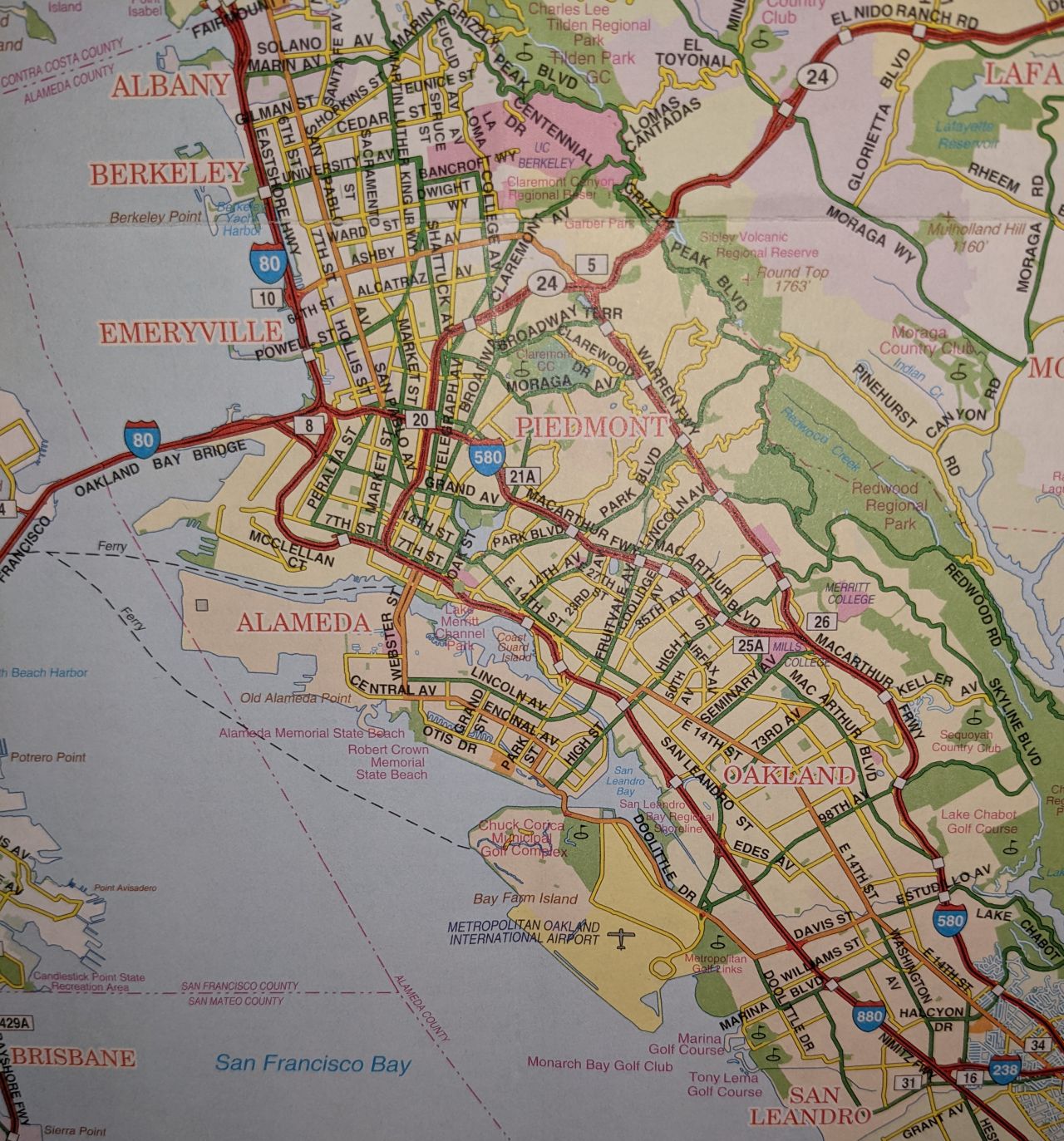
The map covers the entire Bay; this is just about 1/3 of the width and 1/4 of the height of it. It has been clearly designed with driving in mind: you can see all the highways (red), with their exits (the white squares); if you're familiar with the area, you can recognize many of the highway exit signs, too, from all the street names.
It's actually fun to look at. There is no need for scrolling and zooming in, as the entire thing is on the wall. It's also a nice thing to have on a wall since it doesn't catch your attention from far away with big letters you can read.
But... if this is so nice, why am I not looking at maps more for fun? Sure, maybe it's a bit more zooming, but they're equally great, right?
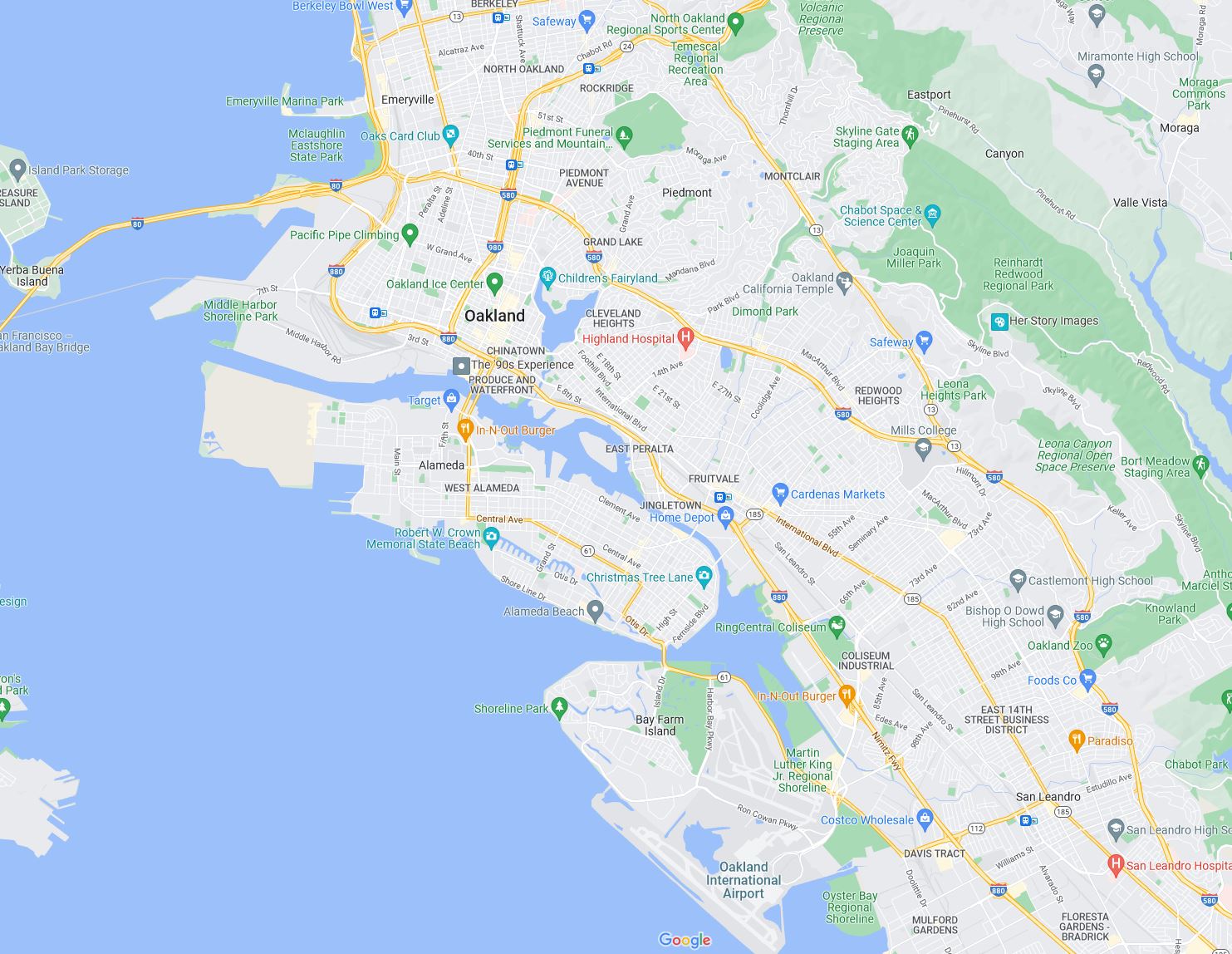
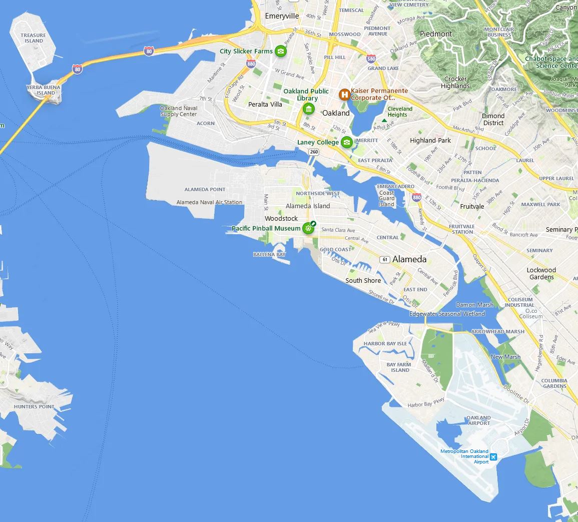
... or maybe Bing Maps? (... zoomed in a bit more?)
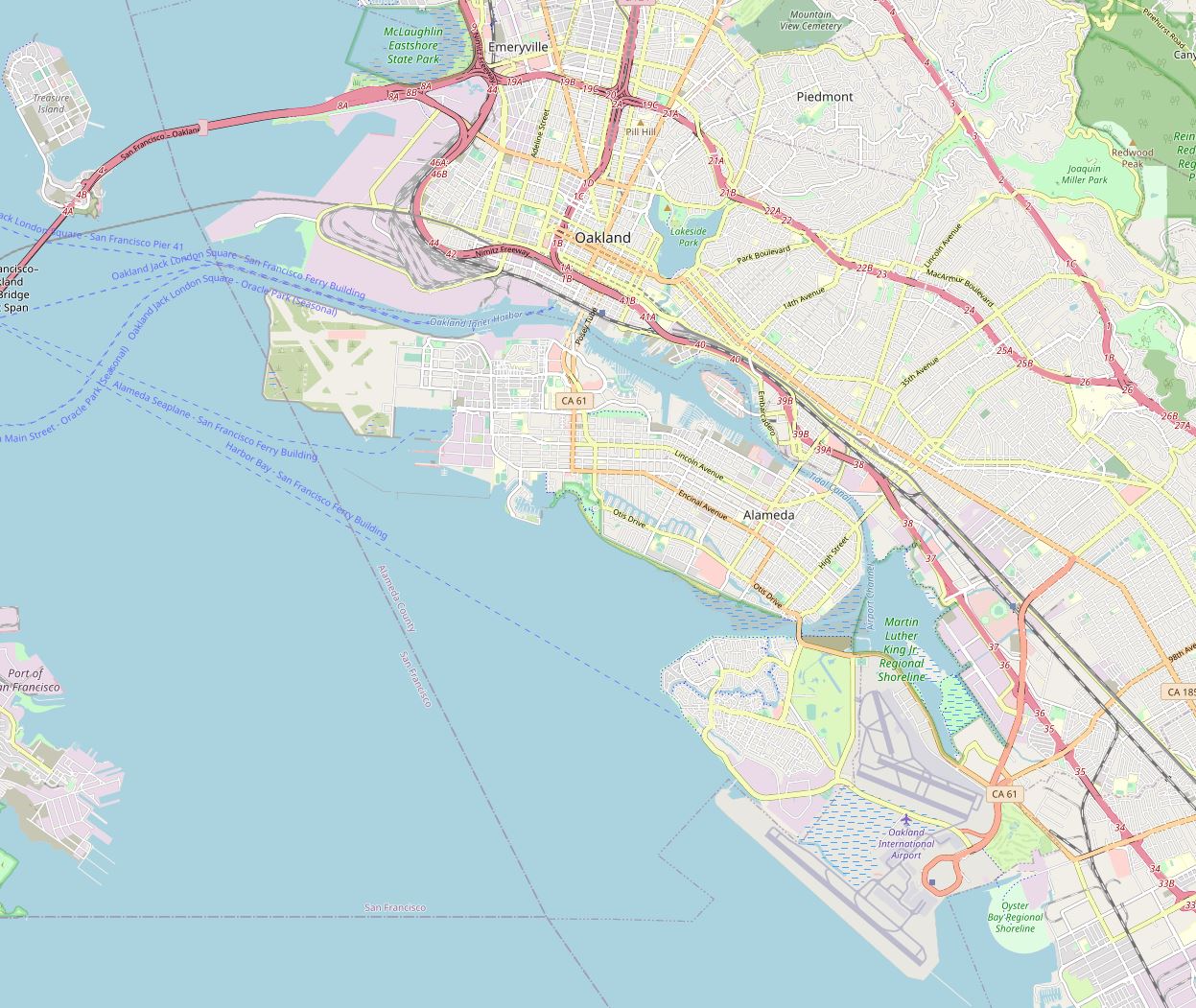
OK, openstreetmap.org will surely be different...
Well, the online ones all look roughly similar. There is a road network; there are some labels. You generally do find highway numbers (eventually). You also have... interesting text size ratios (... why exactly is "Kaiser Permanente Corporate Of(...)" more prominently featured than the entire city of Oakland? and yet, the "offices" text somehow still didn't fit...?)
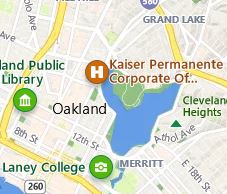 Why does OSM think that this road called "CA 61", barely featured on the paper map, is of such an immense importance that it should be the only road number on the entire map? How do you even tell apart random parks from entire cities if they have the same font size?
But most importantly:
... why are they all just... empty?
Yes, obviously, we can just zoom in more; those street names do show up eventually. Except... by the time they do, you don't really have a nice overview; also, the street names are still very tiny. As if all of them were intent on showing us mostly just unlabeled blocks of buildings... whitespace, basically. The ratio doesn't change, no matter how much you zoom in. It looks nice and roomy, putting some random labels on if it encouters too much whitespace, to casually let you know that there is something there, too.
Meanwhile, the paper map clearly has an agenda. It wants you to know which way to take if you're driving. Cities? Giant red letters, because people generally know where those are. Major streets? Add as many of them as possible, thickly marked, color-coded and labeled, not accurately over the street itself but informatively so that you can find them. Can you find the highway 580? Sure you can, it's a giant blue sign.
It's definitely less elegant. But it works.
... but why?
Of course, there is the default answer of "whitespace is fashionable". But... it's probably not just that. It's the goal of these maps that are different. Or... at least assumed to be different, by whoever is making them.
The argument could go as such: you're only using the online ones for search and turn-by-turn navigation anyway. If the only thing on the (overview) map was an unlabeled road network with the possible destinations, you'd still be fine; you can roughly tell how far it is, so you just get into your car, the map tells you where to turn left or right, that's it. Everything else is just neat embellishments, since an entirely empty map would look weird, so let's put some things on it. Doesn't matter what. You'll search / plan a route anyway.
If, on the other hand, you want a map because you want to know where things are... you'd want actual content. Which the paper map nicely provides.
And... it's the same thing that makes it more interesting, too?
... comments welcome, either in email or on the (eventual) Mastodon post on Fosstodon.